Digital Accessibility: A UX/UI Designer's Guide to Common Hurdles

Silhouette of a person in wheel chair

As UX/UI designers, we often stand on the frontier of creating truly inclusive digital experiences. While the principles of accessibility might seem abstract, they manifest in very real and often fascinating design challenges. In this post, we're pulling back the curtain to give you a sneak peek at some of the common accessibility hurdles we encounter – and how we, as designers, approach finding elegant and user-centered solutions.

The Color Contrast Conundrum - When Branding Gets in the Way

You might have a strong vision for your brand's visual identity, and that's fantastic! Often, this involves a specific color palette that's central to your brand recognition. However, sometimes these beautiful brand colors can present an unexpected challenge when it comes to ensuring everyone can easily access and read your digital content. It's also important to note that for many businesses operating within the European Union, meeting digital accessibility guidelines is no longer just a best practice – it's becoming a legal requirement under EU law. The European Accessibility Act, with key provisions coming into effect in June 2025, mandates that certain products and services, including websites and mobile applications, must be accessible to people with disabilities. Meeting the stringent color contrast ratios demanded by guidelines like APCA (Accessible Perceptual Contrast Algorithm) or even the older WCAG is a key aspect of this compliance and can feel like a tricky balancing act between brand aesthetics and universal usability.

Example: Example grid of color contrasts in a color palette showing that most combinations do not meet contrast guidelines.

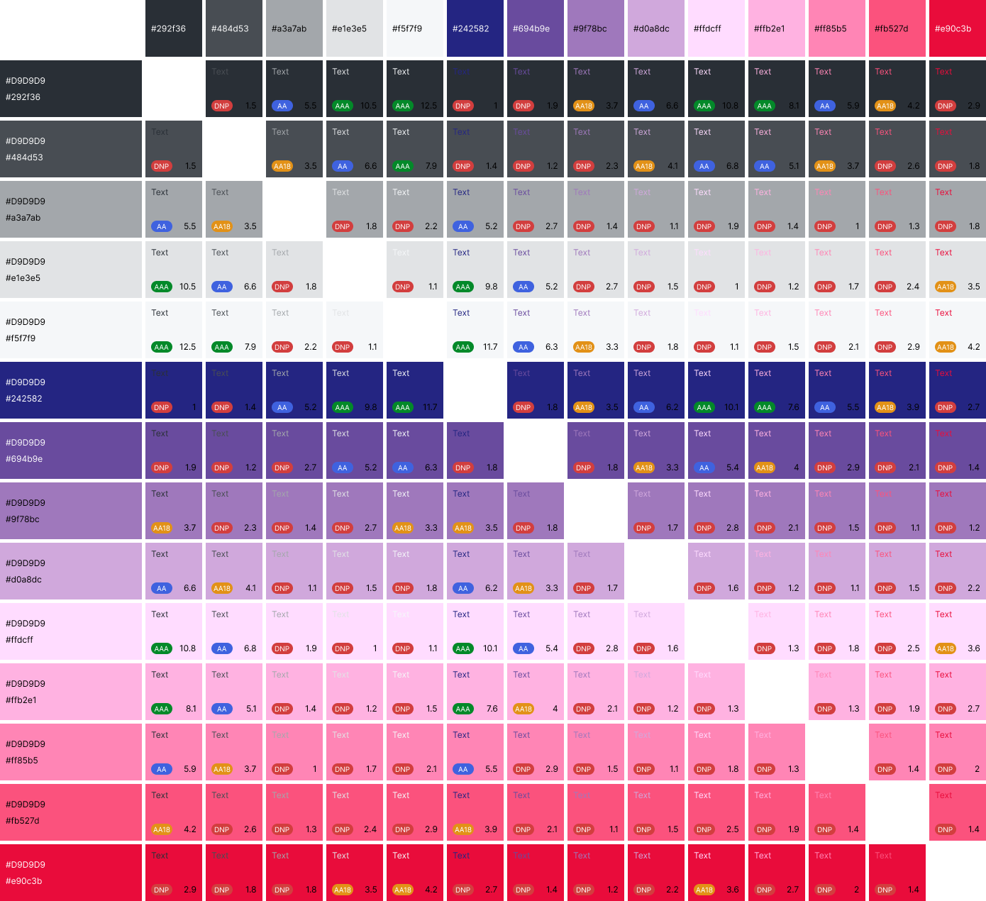
Example grid of color contrasts in a color palette

From a design perspective, insufficient contrast isn't just a technical detail or a legal hurdle – it directly impacts how effectively your message is received. Imagine your audience struggling to read key information because the text blends too much with the background. This can lead to frustration, a negative perception of your brand, and ultimately, a barrier for a significant portion of your potential users, including those with low vision.

So, how do we, as your design partners, navigate this chromatic tightrope? We believe in finding solutions that respect your brand identity while prioritizing accessibility and legal compliance. This might involve exploring subtle variations within your existing palette, strategically introducing accessible secondary colors, or creatively using UI patterns to enhance contrast where needed. It's about solving a visual puzzle to ensure your message is both beautiful, legally compliant, and universally accessible.

The Mystery of the Missing Alt Text - Painting Pictures with Words

In the visually rich world of the web, images often convey crucial information or context. But what happens when those images are invisible to someone using a screen reader? That's where alternative text ("alt text") comes in. It's the descriptive language that paints a picture with words, ensuring everyone gets the message.

Example: Photography of a newspaper with cut out images making it impossible to grasp the whole picture of an article

Newspaper with cutout portions

For us, missing alt text isn't just a technical oversight; it's a break in the user experience. It leaves users relying on assistive technologies with a gap in their understanding, hindering their ability to fully engage with the content. It's like having a crucial part of a story omitted.

We see crafting effective alt text as a core part of our design responsibility. It's not just about describing what the image is, but also conveying its purpose and context. We advocate for meaningful alt text that contributes to a richer understanding of the content for those who can't see the visuals.

The Unseen Labyrinth - Issues with Content Structure, Irregular Flow, and Code Order

When we design a website, we often think about how it looks visually. But beneath the surface, there's a crucial digital architecture – the way content is structured and ordered in the code. While it might seem technical, this underlying structure directly impacts how users navigate your site, especially those relying on assistive technologies. An irregular content flow or a wrong order in the code can create an "unseen labyrinth," leading to unintended content order when accessed by screen readers, keyboard navigation, voice control, and other assistive devices.

Example: Photography of a bridge which is constructed from components in wrong order which makes it impossible to cross

Bridge constructed from components in wrong order

For us, this isn't merely about visual design; it's about ensuring a logical and predictable user journey for everyone. Imagine a screen reader announcing elements in a chaotic sequence, or a keyboard user jumping illogically across the page. This disconnect between visual presentation and the underlying code structure leads to confusion, frustration, and can prevent users from completing essential tasks. It's like having all the right information on a page, but presenting it in a scrambled, unintelligible order.

During the design process, and also later on in the development and maintenance stages, ensuring a clear and semantic content structure is paramount. This means meticulous planning of focus order, logical grouping of elements, and the correct use of HTML semantics.We work closely with developers and content editors to ensure that the code accurately reflects the visual and logical hierarchy of your content, creating a consistent and accessible experience throughout your digital product's lifespan. 

The Interactive Illusion - Ensuring Functionality for Everyone

Interactive elements are the building blocks of dynamic digital experiences. But are they truly interactive for everyone? Ensuring that buttons are clearly identifiable, links are distinguishable from surrounding text, and forms are easy to understand and operate is crucial for accessibility.

Example: Photography of a red button in a glass box making example of interactive element being impossible to interact

Red button in glass box

When interactive elements aren't designed with accessibility in mind, they can create significant barriers. Ambiguous labels, insufficient feedback after an action, or complex interactions can leave users feeling lost and unable to achieve their goals. It's like trying to open a door without knowing where the handle is.

We focus on creating clear affordances – visual cues that indicate an element is interactive. We also prioritize providing sufficient feedback to the user after an action and ensuring that all interactive elements are operable via keyboard and screen readers.

Conclusion

These are just a few glimpses into the fascinating world of digital accessibility from the perspective of UX/UI design. It's a continuous learning process, filled with problem-solving and a deep commitment to creating digital experiences that are truly for everyone. Our ultimate focus is to help our clients successfully accomplish their goals – the very reason their digital products exist. 

If you're ready to create an inclusive and high-performing digital product that serves all your users, we'd love to connect. Let's start our next venture together.

Expert Digital Solutions for Your Business

Partner with Bright IT to create scalable websites, e-commerce platforms, and web applications that drive your business forward.

Man in forest